David Langevin – Friday Night Guest – January 14, 2022
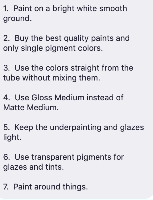
7 Guidelines to increase luminosity and vibrancy in your painting
(Submitted by Iona Bertrand)
David Langevin captivated the audience at this very well-attended evening with clear explanations of his seven guidelines and visual examples. The question and answer period went on for 40 minutes, attesting to the interest and excitement of DVAC members. Please see photo for the guidelines list.
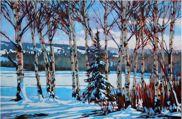
David explained in detail how light refracted off smooth versus rough surface, rendering the same colour appears dull when laid on a rough substrate. He often sands and triple-gessoes a surface even before starting to paint, to ensure smoothness.
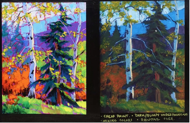
He then demonstrated why pure pigment colour in top-quality brands looks more vibrant, as opposed to a mixture of pigments, as each additional pigment adds distortion/ interference to the perceived colour. Low quality paints contain fillers besides, which further degrades luminosity and intensity. So he showed us the same painting done a) with high-quality, one pigment colours, b) with several pigment colours, and c) with cheap, low-quality colours [like student grade]
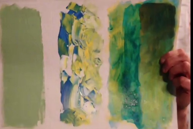
David then proceeded to mixing techniques, demonstrating through multiple examples how letting the colours mix and overlap on the substrate preserves vibrancy, whereas mixing them to a homogenous paste on the palette muddies the colour. He also specified he uses the colours straight from the tube, adding very little water [maximum 25%], if any, in order to not dilute the binding power and flexibility of the polymer in the case of acrylics.
With further examples of various mediums, he recommends gloss medium rather than matte, if your aim is to preserve maximum intensity of your colours.
David used many examples to show how he under paints in light [not dark] and with transparent colours, to preserve the white luminosity of the substrate, and how layering the colour achieves the push-pull optical effects sought. He is often using transparent glazes – which he calls veils – like in watercolour, adding cumulative warm or cool layers for a luminous effect – a bit like altering an image in Photoshop. He further demonstrated how to obtain balance in a painting with sharp contrasts in the areas of interest [he paints the darks last], tempered with neutrals painted around the subject, to enforce focus and distance.
This was a very illuminating evening, where discussing many technicalities that underpin the desired effects were dissected and put back together with many illustrations of how – and why – they work. Thank you very much, David!
We await with great excitement the second installment of David’s presentation: a demonstration of how he implements the described guidelines!