David Langevin 2 – Friday Night Guest – January 21, 2022
( Submitted by Iona Bertrand)
Demonstration of his 7 Guidelines to increase luminosity and vibrancy in your painting
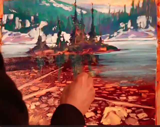
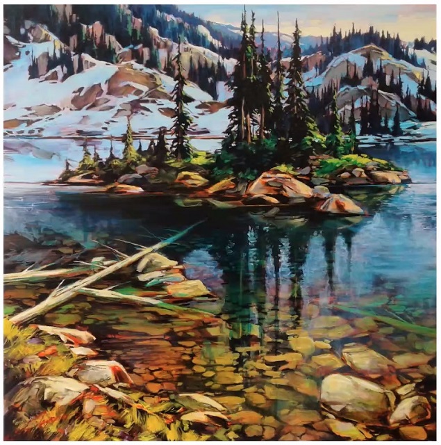
For the second part of his presentation – demonstrating the guidelines explained the previous Friday – David Langevin attracted again a packed house. He chose to render one of his own larger paintings of Miller Lake by Revelstoke in BC, by painting in acrylic on a canvas board [just for the demo]. He very clearly explained his process step by step, and gladly answered our members’ many questions.
It is hard to describe all the stages for those who were not present, as the progression was truly fascinating. The following snapshots give an idea of the evolving of David’s work. In general, he uses fluid acrylics for transparent washes, which he calls veils, and heavy body acrylics for opaque layers. He mixes his paints with Golden GAC 100 or 500 in a proportion of 50-50% as retarder [so the paint takes longer to dry], and uses gloss medium to thin the paint towards transparency without weakening the polymer bonding of the paint. He does not use water.
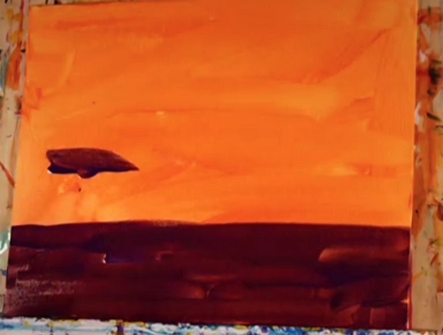
1) David draws preparatory sketches, but not on the canvas. For the imprimatura [= 1st layer of paint] he used a diluted orange pigment for the whole board, and layered a glaze of Dioxazine purple + gloss medium + retarder for the bottom third [lake].
2) He then proceeded to subtract from the still wet purple layer, using spatulas, Q-tips, fingers, etc to already place the rocks and logs in the lake, creating hard edges for the foreground features, and soft edges/ smaller objects as they recede in the background.
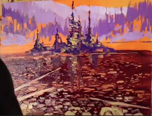
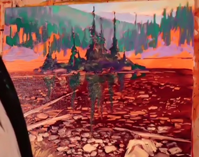
3) He used the purple to anchor the island trees, then prepared 4 tints of purple of varying values for the background mountains and trees, applying the paint with gestural strokes that left some of the imprimatura peeking through.
4) David prepared three tints of phthalo green to define the trees and some reflections in the water. He used a sky glaze by mixing nickel Azo yellow and phthalo blue with titanium white.
5) He added a cadmium yellow medium heavy body for tree highlights and grass on the island, as well as in the foreground, angling the brush to give movement to the grass. He also added some titanium white for the snow in the background.
6) David laid a blue glaze [phthalo blue + lots of gloss medium] over the background, between trees. He then laid a blue tint veil over the water in the distance, adding more gloss medium for increased transparency in the mid-distance, softening the edge with a rag, to smooth the transition to a phthalo green + gloss medium veil for the water closer still, followed by a yellow glaze blended in the green for the bottom most layer of the painting.
7) To increase depth perception, David laid some Indian yellow over the rocks in the middle of the foreground. Also, he added warm yellow for island rocks and reflections, and highlights on the foreground grasses.
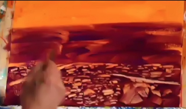
8) Now the painting was established, David proceeded with a fluid carbon black + gloss medium for the darkest shadows, starting at the bottom, to better define the submerged rocks, water reflections, etc and diluting the black towards the distance.
David explained the difference between
- an isolation varnish he puts over a finished painting [to protect it], like 2-3 layers of gloss medium, or Golden isolation coat, or a soft gel medium diluted with 1/3 of water, and
- the picture varnish he puts on top of the isolation varnish, which would be removable with solvents later on without going beyond the isolation coat. Examples are Gamblin Gamvar, or Golden MSA, or Liquitex’s Soluvar.
The question and answer period was lively and very technical, but also informative.
We thank David Langevin for his masterful presentations of the past weeks, which were enjoyable and enlightening in equal measure.
https://www.instagram.com/langevin_david/
https://www.facebook.com/profile.php?id=100008768288039